
Orugunaizu by JT
ORUGUNAIZU By JT provides home organizing based on the KonMari™ method. The service focuses on helping people keep items that spark joy, applying Marie Kondo’s approach to tidy small apartments as well as full households. Aimed at clients aged 17 to 60 with mid-range pricing, the work uses a simple, Japanese-inspired aesthetic to clear clutter and create calmer living spaces.
What the project had to solve.
Orugunaizu's owner wants the logo to incorporate Japanese culture and reflect the business's core services, while keeping the overall branding natural and gender-neutral.
We conducted in-depth research on Orugunaizu’s business, competitors, target audience, and Japanese culture to gain a comprehensive understanding of the right brand identity design.
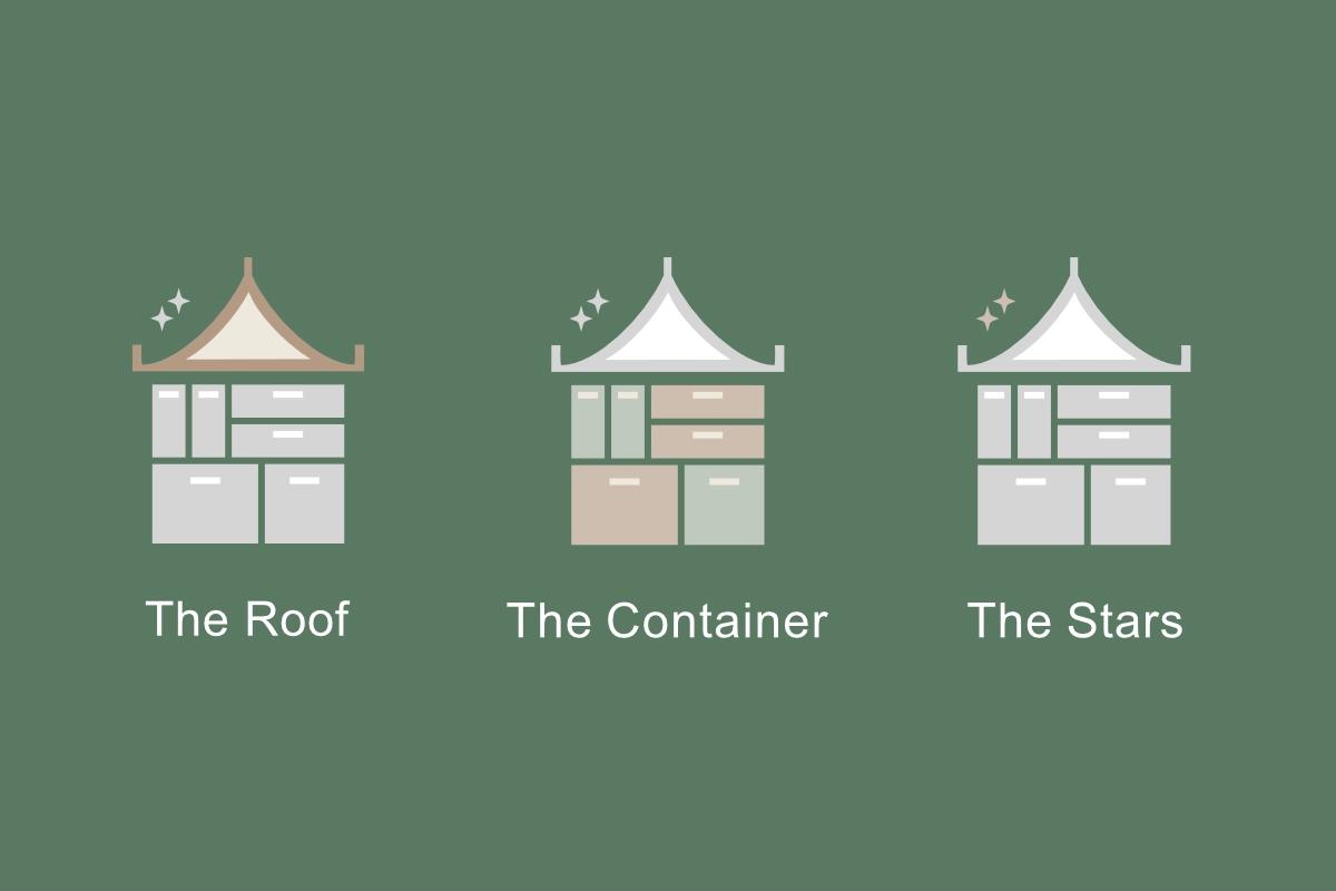
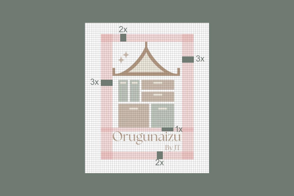
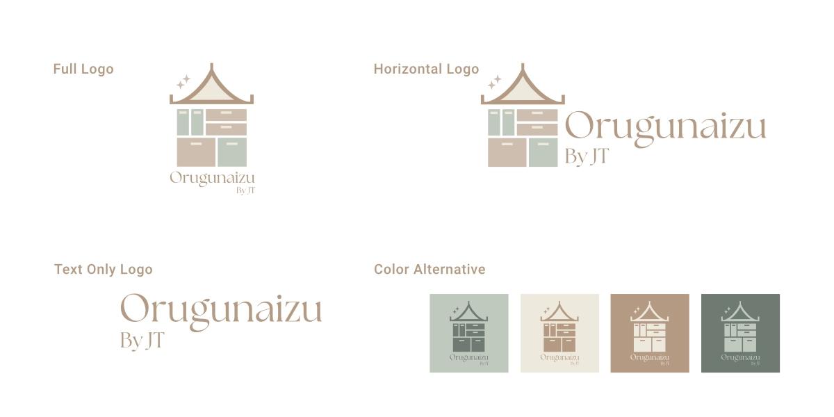
Based on the brief, we explored several sketch concepts before settling on the final design. The logo combines three parts: a roof shaped like a traditional Japanese home, six stacked containers representing Marie Kondo’s six rules of tidying, and stars referencing the "spark joy" concept. We also included clear spacing guidelines so the mark stays consistent across print and digital layouts.
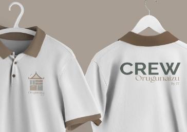
By applying the brand identity based on our guidelines, Orugunaizu maintains a consistent look across all touchpoints, making it easier to recognize and remember for both current and prospective customers.
What we handed over.
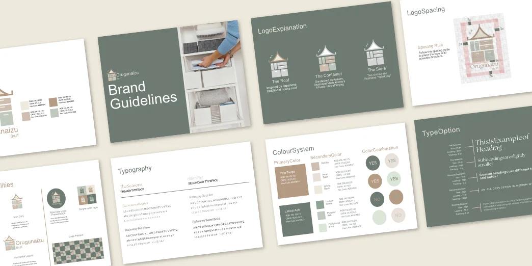
- Logo System Company Profile and Comprehensive Brand Guideline.
- Typography System
- Color System
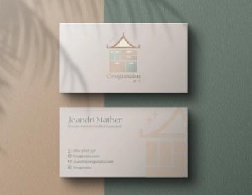
- Stationaries (Business Card, ID Card, and Letter Head)
- Company Profile
- Comprehensive Brand Guideline
More work from the same archive.
Two more projects with the same level of scope detail.
Have an upcoming project? Let's talk through the details.
Whether you are launching a new venture or refreshing an existing identity and website, reach out to discuss your timeline and goals.